Author: Natasha Cantwell
Communications & Public Programming Officer
Forty years ago, the Victorian state government asked the general public to design an icon to rival the well-known wonders of the world - or at least to compete with Sydney’s iconic Opera House. The challenge to reimagine the railyard space around Flinders Station (including the area where Federation Square now stands) was taken up by 2300 hopefuls, eager to unleash their creativity on Melbourne. In an effort to grab the judges’ attention, the majority of contestants tended towards a ‘bigger is better’ mentality, which was ultimately their undoing. Competition judge Patrick McCaughey publicly attacked the proposals for demonstrating “a megalomania that makes the pyramids look like pimples.”1 In fact, the entries were deemed so unviable that the project was abandoned altogether, with prize money shared between 48 finalists and none of the proposals being built. It is these gimmicky, over-sized monuments that have been the focus of many exhibitions and articles over the years, but let's look a bit deeper into the collection.
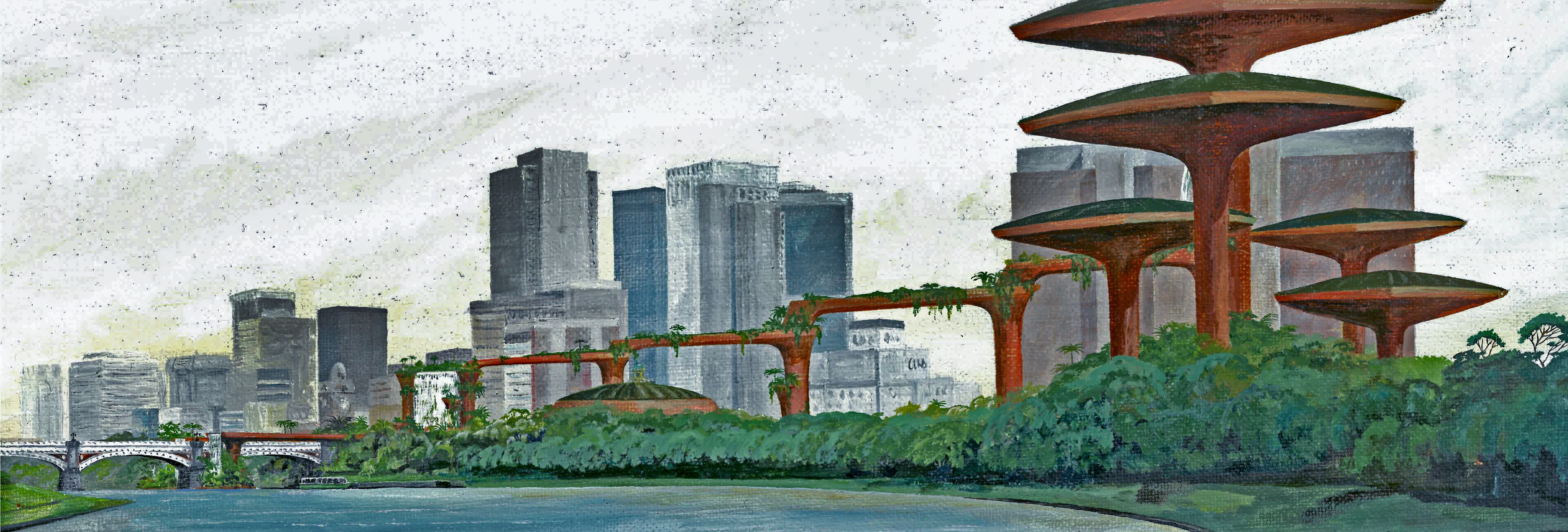
In 2019, as Melbourne manages increased population density and the effects of climate change, it is interesting to look back through those 1978-79 landmark submissions that sought to increase the livability of the urban environment through green (or blue) space.
Can we imagine Fed Square with a little less concrete? Or perhaps even completely covered with forests and cascading waterfalls? As McWilliam and Partners Pty Ltd explained in their proposal titled Action Gardens, “More and more people will live in cities, but cities need their grey hearts softened with green.”2 Rather pessimistically, they also added that in the future “Artificial environments maybe the only ones where plants may survive.”3
Entries spanned 24 countries and ranged from scrawls in ballpoint pen, through to meticulously crafted submissions from noted architectural practices, including Denton Corker Marshall, who were later responsible for the Melbourne Museum, Melbourne Exhibition Centre, Melbourne Gateway and Bolte Bridge. Their 100 metre high Great Wall and Hanging Gardens features Escher-like staircases intertwined with lush plant life.
While the quality and ideas vary, some definite themes are apparent. The most common reason given for why Melbourne’s new landmark should be a garden is the potential mental health benefits, with proposals often describing the city as a harsh, uncaring environment. However, it is hard to tell how many of these entrants are drawing from an actual experience of Melbourne, or if this is just their impression of cities in general. English designer Bernard Alfred Ashfold’s submission Water Palace and Water Gardens proclaims that “A modern city cries out for oases of peace, tranquillity and beauty where the shocked, the bruised and the troubled can recover their peace of mind.”4
Many proposals share a retro-futuristic utopian vision of what Melbourne could become. Thirty eight different entrants imagined a technologically updated version of the Hanging Gardens of Babylon, while many others designed space-age symbols (including a number of flying saucers) that were dripping with vegetation. Gardens spiralled into the sky around glass elevators and waterfalls pooled into artificial ponds suspended over motorways.
Nature and progress merged together in wonderful and perhaps impossible ways. As the competition brief asked for ideas, rather than designs, most entries only included a few token technical specifications. Others completely glossed over the impracticalities of their design, or simply said that they’d leave those details up to the engineers to work out. While many of these submissions may have been infeasible, they do make you think about the multitude of ways in which we could be injecting nature back into our concrete jungle.
Original records from this collection will be on display at Melbourne’s green spaces: From sci-fi fantasy to future reality, as part of Melbourne Design Week 2019. Alongside the exhibition, guest speakers Peta Christensen from Cultivating Community, Warwick Savvas from ASPECT Studios, Andrew Laidlaw from the Royal Botanic Gardens and Skye Haldane, manager of design at City of Melbourne, will discuss their visions for the future of green spaces in our city.
Tickets are free and available through Event Brite here.
1. ‘Professor says landmark-contest entries 'banal'’ 1979, The Canberra Times, December 18, p. 3.
2 & 3. PROV, VPRS 2869/P2, Unit 763
4. PROV, VPRS 2869/P2, Unit 858
Material in the Public Record Office Victoria archival collection contains words and descriptions that reflect attitudes and government policies at different times which may be insensitive and upsetting
Aboriginal and Torres Strait Islander Peoples should be aware the collection and website may contain images, voices and names of deceased persons.
PROV provides advice to researchers wishing to access, publish or re-use records about Aboriginal Peoples


